The photo gallery was unreachable by keyboard
Tiles were <div>s with click handlers and no tabindex. Converted to real buttons, so the archive works without a mouse.
 Case study · 2026
A volunteer-run foundation throws a Bollywood Gala every year to raise money for cancer charities. Their site didn't show any of that. I designed and built the new one end to end: structure, screens, and code.
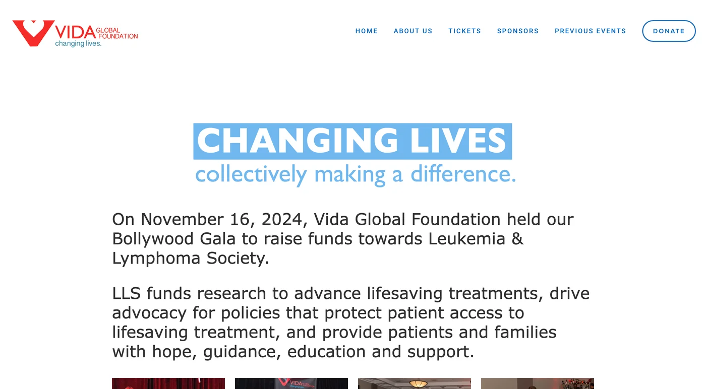
It's still live. A decade of sold-out galas, and the homepage opens with a wall of text, then dumps every photo ever taken into one endless grid.

Volunteers built and maintained this while running actual galas, which is admirable. My job was to give the work a site that sells it.
Three questions drove the layout: what earns the first screen, how does a decade of photos become browsable, and where does Donate live. I wireframed until those had answers.
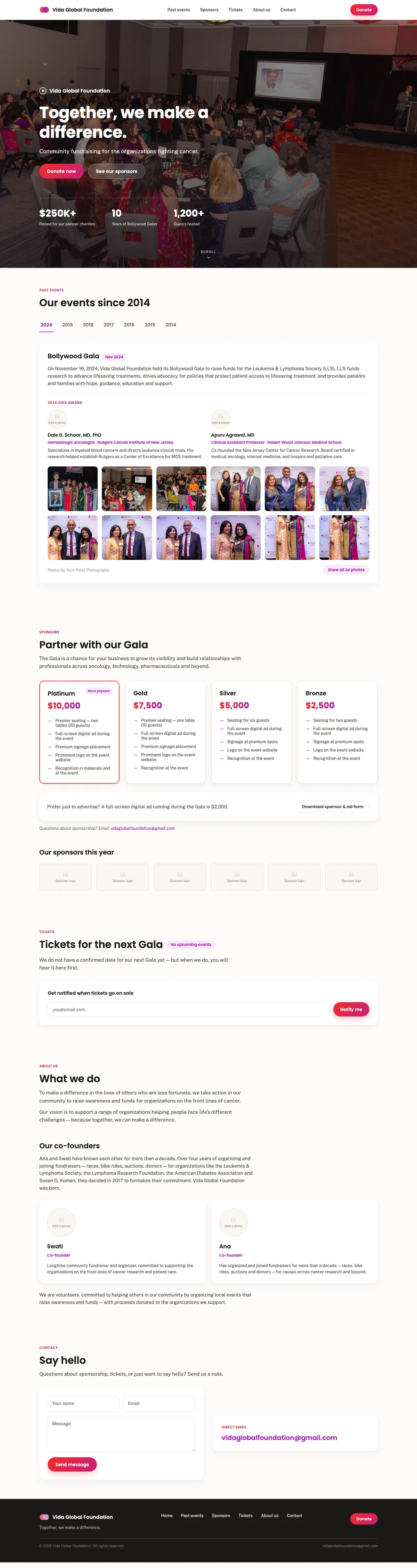
Same foundation, same photos, same mission. Drag the seam.
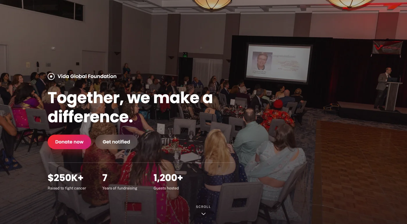
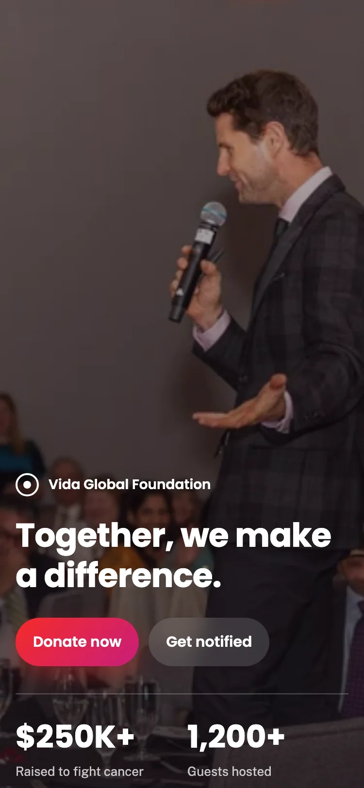
The old homepage led with text on white. The new one leads with the room, keeps Donate first, and puts the numbers where a first-time visitor will actually see them.
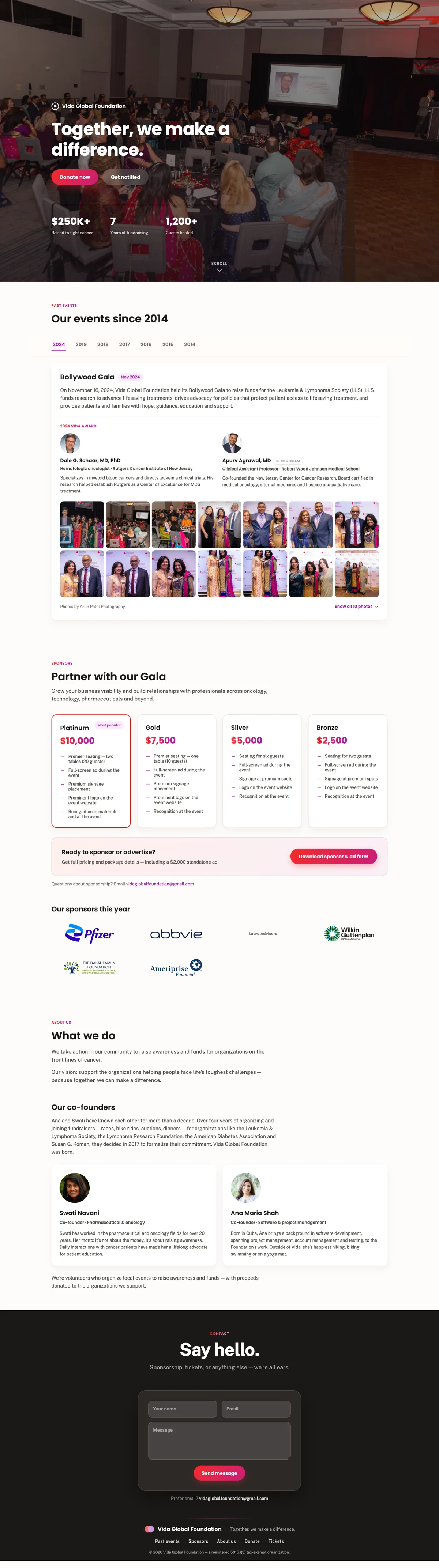
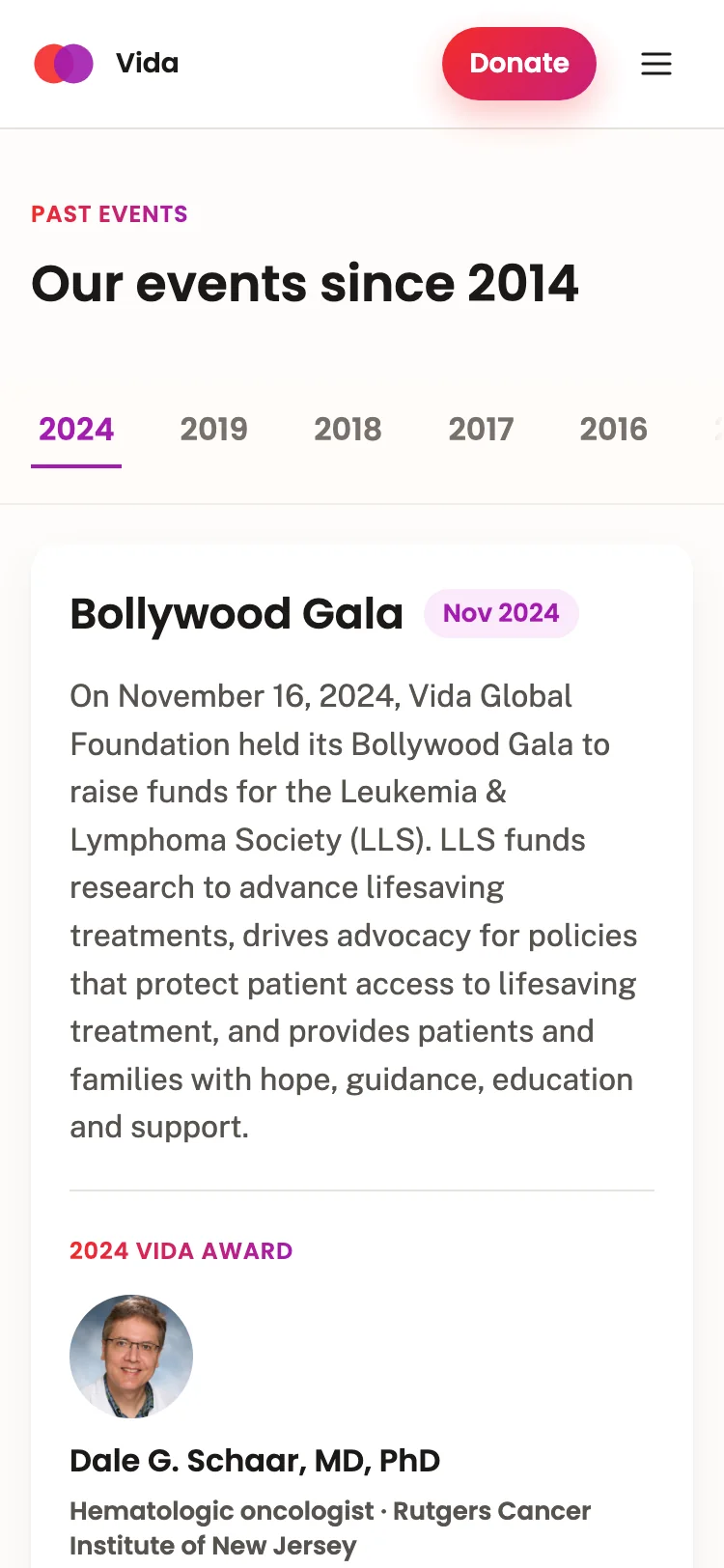
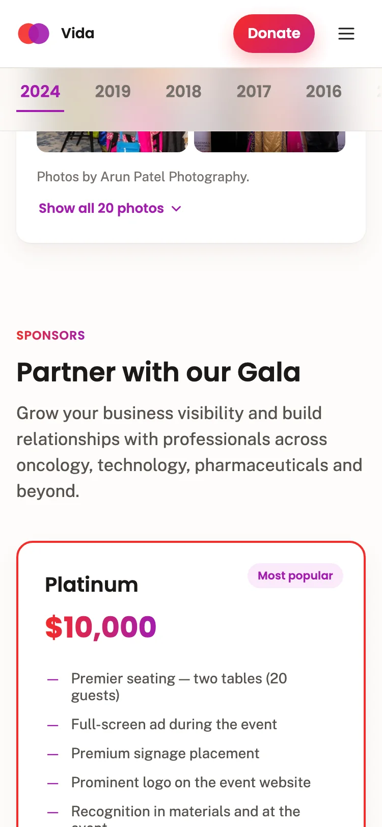
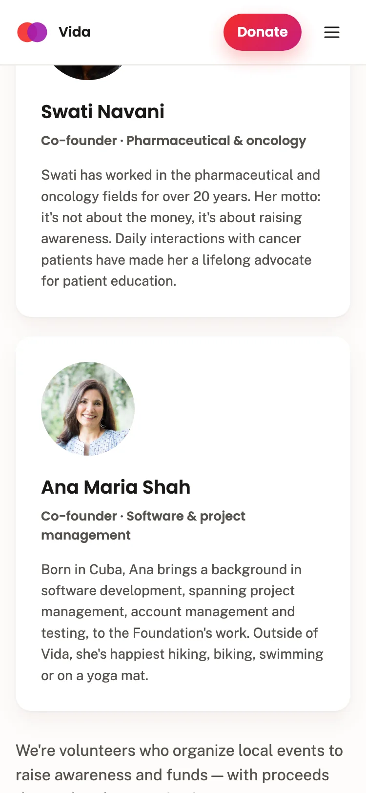
The old site had no real mobile story. The new one was designed for phones from the wireframe up: a compact nav, two stats instead of three, and galleries that stay two rows deep. Every screen here is the real site at iPhone width.
Nobody handed me a spec. These are the decisions that shaped the site, including the ones where my first idea lost.
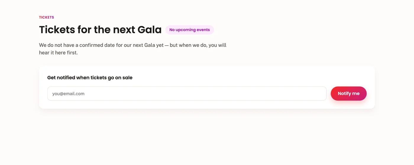
My first layout had one: a heading, a "No upcoming events" pill, an email form. A full scroll stop whose only message was that there's nothing to buy. Designing it made the problem obvious.
I deleted it and moved the one useful piece, the email capture, into a hero button. When a gala gets announced, a single ticketsLive flag turns real ticket buttons back on across the site.
 Cut
Cut
This is the real interaction, not a recording. Open the field, then switch to 375px: Donate collapses so the row never wraps, and the confirmation dismisses itself after four seconds so the donate button doesn't stay buried.
Vida Global Foundation
Together, we make a difference.
We'll email you when the next Gala is announced.
Exit runs at 100ms, entrance at 130ms. Faster out than in reads as one continuous move instead of two steps.
Three stats sell the story on desktop. At 375px they wrapped 2+1, which reads as a layout bug. Mobile shows the two that persuade most, money and people, and "years of fundraising" still lives in About.
Sponsors pay real money to be here, so their logos have to feel fairly sized. Normalizing to one height was my first attempt and it looks wrong: AbbVie is a wide flat wordmark, Pfizer is a compact lockup, so "equal" makes AbbVie enormous.
A width cap balances how big each one feels. It's a rule rather than a per-logo hack, so next year's sponsors behave too.



Designing it isn't finishing it. I ran the site through a keyboard, a screen reader, and the profiler, and measured everything here in the browser — including two contrast failures I had introduced myself.
Tiles were <div>s with click handlers and no tabindex. Converted to real buttons, so the archive works without a mouse.
Focus could Tab to controls hidden behind the scrim. Added dialog semantics, focus restore, and inert on the page behind it, plus arrow-key and Escape support.
An early version shipped outline: none with nothing in its place. Every focusable element now has a visible ring that doesn't depend on JavaScript.
WCAG AA wants 4.5:1. The photo credits and footer text were my own early color picks, and both failed. These chips are the real colors.
Responsive srcset serves phones a phone-sized hero instead of the 2500px desktop file.
The old site loaded every gala photo at full resolution, roughly 600 KB each. The archive now serves 500px thumbnails and full size only in the lightbox.
Zero runtime dependencies, and the hero slideshow pauses when it's off-screen instead of crossfading forever.
The site is built and measured. What's left isn't design work, it's truth-checking, and I'd rather hold the launch than publish a number nobody can stand behind.
The impact stats came from old materials, and donors make decisions based on them. So before launch they go to the founders in a doc, not onto the internet. Two excerpts from the real one:
Is Vida Global Foundation officially a registered 501(c)(3)? I want to be certain before it's public — it's a legal claim, and donors rely on it for tax deductions.
The site lists events in 7 years with a gap from 2020–2023. My instinct is "Since 2014" — it's true, simple, and sidesteps the gap entirely. Your call.
Once the founders sign off, the new site replaces the old one at vidaglobalfoundation.org. The forms hand off to email on purpose: a volunteer org shouldn't inherit a backend to babysit.